Poshy Tip - jQuery Plugin for Stylish Tooltips

I almost hear you asking - why another jQuery tooltip plugin? Well, I actually never planned creating this plugin until I reached the final stages of designing this website and decided to add some pretty tooltips. So I started looking for a tooltip plugin that allows easily creating stylish tooltips and also includes the most useful features for such a script. However, I wasn't pleased with the results I found so I ended up writing a completely new plugin and am now making it available for all.

Demos

You might be eager to take a look at some examples so here is the demo page right away. And below you will find a short introduction.

Notable Features

OK, so apart from the awful name, is there anything interesting about this tooltip plugin?

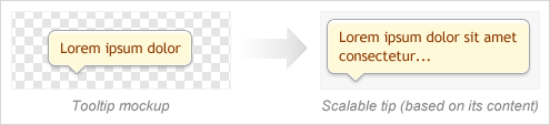
A Single Background Image for Scalable Tooltips

Suppose you need to code a scalable tooltip that looks like this (i.e. a tooltip with auto width/height based on the content inside it):
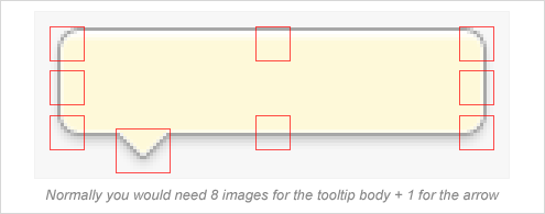
A figure showing a tooltip mockup that should be used to create a scalable tooltip on the page

The Usual Approach

To achieve this with most similar plugins out there you would need to slice the image into multiple separate images - for the corners of the box, for the sides, etc.:

A figure showing how you would normally need to slice the mockup into 9 images in order to code a scalable tooltip

The Poshy Tip Approach

But since the tooltips only work when JavaScript is enabled anyway, why not apply some JS magic which would make our life easier and save our server some additional requests? This is exactly what Poshy Tip was designed to do. With this plugin, you can create a scalable tooltip by just using a single background image for the tooltip body:

With Poshy Tip you need just 2 images - one for the tooltip body + 1 for the arrow

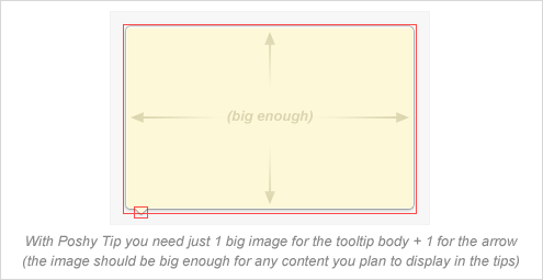
You need to create one big image for the tooltip body - e.g. something like 1024x768 pixels (which should be enough for anything you may want to display inside a tooltip in the browser viewport). You then have to set it as a background image for the tooltip container DIV in the most trivial way:

.tip-yellow {
	...
	background-image: url(tip-yellow.png);
}

Poshy Tip detects when a background image has been set for the tooltip container DIV and creates a scalable frame from it that wraps the inner contents of the tip. Finally, you just need to specify what should be the size of the background image frame around the inner content by setting the following option:

bgImageFrameSize: 10 // pixels

And the result:

A figure showing the scalable frame created from the background image that wraps the inner DIV

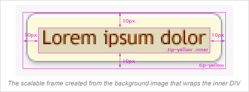
You can, of course, tweak the margin/padding of the inner DIV if needed.

Advanced Positioning Options

With Poshy Tip you can position the tips relative to the mouse cursor or to the target element and align them in every possible way horizontally and vertically (note the alignTo, alignX and alignY options). In addition the script makes sure the tips are always displayed in the browser viewport and also automatically positions the arrow (if available) on the appropriate side of the tooltip body.

Asynchronous Loading of the Tooltip Content

Poshy Tip supports using a function for returning the tooltip content and the script also passes an update callback function as an argument to this function. By using this callback, you can easily update asynchronously the content of the tooltip after it has been displayed. You can see a quick example on the demo page.

Documentation

You can find usage examples and a list of the options and methods available on the demo page.

License

Like jQuery, Poshy Tip is dual licensed under the MIT and GPL licenses.

Git

The Poshy Tip source code is also available at GitHub:

git clone git://github.com/vadikom/poshytip.git

Liked this post?

Don't wait & subscribe to RSS or email updates now.
Quick Tip: Sharing is also easy with the share menu below. :)

Comments:

  • Hi
    Is there a way to set the opacity? It might be nice to have the tip say 25% transparent. Can that be done, and if so, how?
    Thank you!

    #80 by: Frank on January 13, 2012 at 07:12
  • The best that I discovered of PoshyTip is that we can send html content alongside the PoshyTipcontent (items to be displayed in the tool tip).

    cheers again...

    #79 by: Premanshu on December 27, 2011 at 09:53
  • admin

    @Premanshu

    Np, cheers! :)

    #78 by: Vasil Dinkov on December 20, 2011 at 18:03
  • Thanks Vasil,

    this is fixed in 1.1

    Long live Poshy tip......

    #77 by: Premanshu on December 19, 2011 at 16:08
  • @Vasil,

    Thanks for the reply,
    I'm using 1.0 and that seems to be the culprit. Yet I found out a way to create the correct tip using the maximum characters to be displayed in the tool tip. May be I'll try with 1.1 and let u know of the results.

    Premanshu

    #76 by: Premanshu on December 19, 2011 at 13:27
  • admin

    @Premanshu

    This was addressed in the latest version of the script v1.1. Are you sure you are not using an older version?

    If you are using v1.1 and are still having the issue, please post an URL to some example I could test and investigate the issue. Thanks!

    #75 by: Vasil Dinkov on December 18, 2011 at 16:56
  • Hey Vasil,

    I'm using poshy tip and it works wonders. I've one small trouble. In IE9 the size of the poshy tip is different than it is in Chrome. And the data inside the tip looks clumsy. Is there a way to set the width (it is set to auto) of the poshy tip for IE.

    Premanshu

    #74 by: Premanshu on December 14, 2011 at 10:20
  • admin

    can i use your jquery plugins only in mit licence.

    Sure.

    #73 by: Vasil Dinkov on September 18, 2011 at 21:15
  • can i use your jquery plugins only in mit licence.

    #72 by: 秦仕川 on September 15, 2011 at 10:02
  • For those who haven't yet found how to have several tooltip on the same page and using the same style, the solution is to use the same style as a class rather than id

    $('.demo-tip-darkgray').poshytip({

    <img src="images/organigramme_r2_c7.png" class="demo-tip-darkgray" title="

    Hope this helps some out

    #71 by: Ben E on August 18, 2011 at 08:08
  • admin

    @Wood

    Once the tip is initialized for selector:

    $(selector).data('poshytip').$tip.outerWidth()
    $(selector).data('poshytip').$tip.outerHeight()

    #70 by: Vasil Dinkov on July 22, 2011 at 12:39
  • This is an excellent plugin.
    I have a question. How can I get the size of the tip??
    Thank you.

    #69 by: Wood on July 21, 2011 at 06:59
  • admin

    @Ashish

    It is already at GitHub - https://github.com/vadikom/poshytip/. Not sure if I need to do anything else in order to enable you to use it the way you like (I'm still not that familiar with Git) but I hope this is enough.

    #68 by: Vasil Dinkov on July 13, 2011 at 17:00
  • Hey I really love this plugin. Is there any way you could add it to GitHub so that I can use it as a Git sub-module in my projects?

    Thanks!

    -Ashish

    #67 by: Ashish on July 12, 2011 at 21:30
  • admin

    @Paolo Groppo

    There was a temporary issue with the database connection. I've fixed it now so please try again.

    #66 by: Vasil Dinkov on July 11, 2011 at 18:10
  • I'M not able to download your excellent plugin... It say "No database selected".
    Cheers
    Paolo

    #65 by: Paolo Groppo on July 11, 2011 at 17:03
  • admin

    @V Bell

    The site was hacked on June 22nd with what seems to be the hack described here http://t.co/yiDfi17. It's all cleaned up now and I sent a request to Google to review the site and remove the warning but I guess it will take some time..

    #64 by: Vasil Dinkov on June 27, 2011 at 12:01
  • BTW, the demo page you link here is throwing an malware alert in Chrome.

    #63 by: V Bell on June 25, 2011 at 23:13
  • Thanks! I didn't know the alignX referred to the box position instead of the tip arrow position. :]

    #62 by: Jason on June 15, 2011 at 13:10
  • admin

    @Jason

    The script just puts the arrow on the correct side of the tip - i.e. top, right, bottom or left. But the actual alignment (i.e. the exact x & y position of the arrow) is set in the CSS file. For example, for .tip-twitter we have:

    .tip-twitter .tip-arrow-bottom {
        margin-top:0;
        margin-left:-5px; /* approx. half the width to center it */
        top:100%;
        left:50%;
        width:9px;
        height:5px;
        ...

    which centers it, while for .tip-yellow we have:

    .tip-yellow .tip-arrow-bottom {
        margin-top:-6px;
        margin-left:15px;
        top:100%;
        left:0;
        width:16px;
        height:13px;
        ...

    which positions it 15px off the left edge of the tip.

    #61 by: Vasil Dinkov on June 15, 2011 at 12:06

Post a Comment: