loadspeaker

Listing all entries in Dailies

So long, Apple.

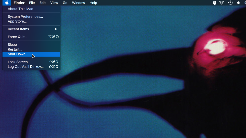
Cursor over a macOS Shut Down... menu option

My beloved MacBook Pro 13" mid 2010 is nearing its end of life as Apple is preparing to halt any support for macOS 10.13 High Sierra and as much as I hate to, I will have to replace it by the end of 2020. It might seem odd it's still my main machine but having upgraded it with a fast SSD and 10 GB of RAM a few years ago, I still find it capable of handling my everyday web development needs.

So what is my dream replacement machine? Honestly, if Apple offered today the same laptop with up-to-date internals, it would be an instant purchase for me. Just give me the same enclosure, ports (I wouldn't mind if you swap the FireWire for USB-C), keyboard and I would be more than happy. I don't even care about the screen, I use an external monitor most of the time.

The keyboard alone deserves a separate paragraph. I have never used an external keyboard and you can imagine how much beating mine has seen in 10 years. And add to that a couple of times my little son forcefully disassemble many of the keys (the Space bar is hardest to reassemble BTW 🙂 ) and still to this day not a single key has failed!

But no, Apple seems to have a different opinion. And I honestly have no clue why they chose to break and cripple something that was not broken. Not broken at all. Soldered RAM, even soldered SSD (is this a joke?), a single port type, no MagSafe (this thing has saved my laptop from dents at least a dozen times), stupid experiments with a rock-solid keyboard (hopefully, they got it right finally). I mean if this is some kind of smart phone-like consumer device, I could understand but you still dare to call this a professional laptop? Sorry, I'll pass.

I've already ordered a HP ProBook 430 G7 which offers practically the same upgradability like my MacBook Pro mid 2010 - 2 RAM slots, SSD slot + 2.5" HDD slot I will gladly use for a backup drive (I like keeping my private data "private" instead of storing it somewhere in the cloud). I don't need a beefy GPU so the integrated one will do just fine. It has a touchscreen and that's always handy for testing. Honestly, I just hope the keyboard is reliable enough, everything else is ideal for me.

Of course, the main thing I will miss initially is macOS but switching to a new platform was not a big issue last time. Ten years ago I went from Windows to Mac. I am certainly never getting back to Windows considering what a complete mess it is today. Honestly, in 10 years I feel like it's only gotten worse, I can't even stand looking at Windows 10's interface mess. UI consistency is arguably not great on any platform but to me it feels like in Windows 10 it's a whole new level of inconsistency.

So it's Linux for me this time and Pop!_OS is my initial choice. I've never used Linux for work but I've played with many different distros through the years and configuring a work station will not be a problem. What does a web dev need today anyway - a terminal, a text editor, a browser, some collaboration app?... It's all there.
How to Disable and Hide the Facebook Chat

After hard and long resistance, I finally gave up and recently signed up for Facebook. I am still not excited about it and quite deeply believe it can mainly bring negatives to people who post all kind of personal stuff. But anyway, since I am using it already from time to time, the single most annoying thing that caught my attention immediately (in the otherwise clean and arguably intuitive interface) was the fixed positioned chat box at the bottom of all pages. There was simply no way to remove it even if I didn't want to use the chat at all. And guess what, it seems the past few days that small collapsed box at the bottom has been transformed into a complete sidebar pushing the rest of the page to the left which is even more annoying (this seems to happen if the browser window is wide enough). Me doesn't like this at all so I am now sharing my solution to this annoyance with you...

Just install this small user script in your browser (Opera, Chrome, Firefox via Greasemonkey or Safari via GreaseKit):

https://raw.github.com/vadikom/facebook-nochat/master/facebook-nochat.user.js

and remove that chat floating box/sidebar for good! As a bonus, it will make sure you always appear unavailable for chat. Second bonus - when the sidebar is removed, the rest of the page will be perfectly centered in your browser window again. Yay!

offsetWidth/offsetHeight useless in IE9, FF4*

OK, I must admit "useless" is a too harsh word but the thing is our beloved offsetWidth/offsetHeight JavaScript DOM properties are now not accurate any more in Internet Explorer 9 and Firefox 4. Firstly introduced in IE4 in 1997, these DOM properties are the simplest and quickest way of getting the computed pixel dimensions (the border-box) of any page element and they used to work perfectly in all browsers released since then. Well, not any more in IE9 and FF4. Read on to learn why and what you can do to workaround the issue...

* A special note for Firefox on Windows/Linux
Firefox 4 on Windows and Linux has this issue only when hardware accelerated rendering is enabled in the Options/Preferences (and, of course, supported on the machine). I always get the issue on Mac.

IE9 and FF4 introduced subpixel font rendering and now calculate and report width/height of page elements using float values even when a web page is viewed at 100% zoom level. This is something no other browser has ever done before. So, right now in IE9 and FF4 you can get computed width/height values for block elements reported like "100.34px", "11.65px", etc. I once heard from a colleague that a client asked him to move a page element by half a pixel because apparently one pixel seemed to much to him. 😃 Well, I've got good news for that guy, this is now possible!

But seriously, let's get back to the issue. As you already may be guessing, the problem with offsetWidth/offsetHeight in IE9 & FF4 is that these properties are integer values so in these browsers the values are computed by rounding the float values for width/height and adding the padding & border. And the rounding often leads to 1px inaccuracy depending on the calculations done in your scripts and on the exact fonts and font sizes used on the page. You may say 1px is nothing but there are cases when 1px could cause quite notable issues like, for example, text wrapping happening when it shouldn't, etc..

Demoing the Problem

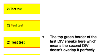
Basically now you can easily stumble upon issues in IE9 and FF4 like on this demo page. In this example, offsetHeight is used to get the computed border-box height of the first DIV and the second DIV has negative top margin applied which is equal to the value returned. The end result should be perfectly overlapping DIVs, so that you could only see the second one. But in IE9 or FF4, you can see either the top or the bottom border of the first DIV sneaking beneath the second DIV for some of the iterations:

A screenshot showing the top border of the first DIV sneaking beneath the second DIV

The Workaround

From the demo above we clearly see we can no longer use offsetWidth/offsetHeight if we want perfect results in these browsers. The workaround is to use the getComputedStyle() method instead which reports the width/height of block elements with float numbers. So basically, the workaround is to get the computed width/height and then add the computed top/bottom padding & border of the element to get the final value. The problem with getComputedStyle() on theory is that for width/height of inline elements it always reports 'auto'. But the good news is these browsers only seem to round the computed float values for block elements and so for inline elements we can still safely use offsetWidth/offsetHeight! Well, if you are still following me, here is a fully cross-browser workaround compatible with all other and older browsers:

function _getOffset(elm, height) {
	var cStyle = elm.ownerDocument && elm.ownerDocument.defaultView && elm.ownerDocument.defaultView.getComputedStyle
		&& elm.ownerDocument.defaultView.getComputedStyle(elm, null),
		ret = cStyle && cStyle.getPropertyValue(height ? 'height' : 'width') || '';
	if (ret && ret.indexOf('.') > -1) {
		ret = parseFloat(ret)
			+ parseInt(cStyle.getPropertyValue(height ? 'padding-top' : 'padding-left'))
			+ parseInt(cStyle.getPropertyValue(height ? 'padding-bottom' : 'padding-right'))
			+ parseInt(cStyle.getPropertyValue(height ? 'border-top-width' : 'border-left-width'))
			+ parseInt(cStyle.getPropertyValue(height ? 'border-bottom-width' : 'border-right-width'));
	} else {
		ret = height ? elm.offsetHeight : elm.offsetWidth;
	}
	return ret;
}
function getOffsetWidth(elm) {
	return _getOffset(elm);
}
function getOffsetHeight(elm) {
	return _getOffset(elm, true);
}

Usage is very simple:

var elmOffsetWidth = getOffsetWidth(elm);
var elmOffsetHeight = getOffsetHeight(elm);

And here is the fixed demo page that includes the workaround.

The Questions

Finally, here are the questions that come to my mind:

  1. Is this the road all other major browsers (i.e. WebKit and Opera) plan to take in the future?
  2. If not, why did IE and FF did it then and shouldn't they revert to the old behavior?
  3. If yes, then shouldn't at least offsetWidth/offsetHeight be fixed to return the preciser float values?

I guess you'd agree it's nice to have these questions answered.

Fix for #NewTwitter: Scrolling the Details Pane

I am getting more and more used to #NewTwitter and generally like the new features. Particularly the details pane, which provides quick preview of images, videos, etc. is really very useful. However, there is something related to it that annoys me much - if you scroll it with the mouse wheel (which is definitely the case with the majority of users) once you reach the top or bottom and continue scrolling (e.g. by accident, which happens to me very often), the whole page begins scrolling and you can easily lose sight of the tweet on the left to which the pane is related. So I am now sharing a simple fix and if you like it, please help to let the guys at Twitter know about it.

Update: Twitter have changed their design so this post covers a previous issue on their website and is no longer relevant.

First, a very quick demo of what I mean:

And the JavaScript/jQuery snippet which fixes the issue:

$('#page-container div.pane-components').live('mousewheel DOMMouseScroll', function(e) {
	var scrollTop = this.scrollTop,
		clientHeight = this.clientHeight,
		scrollHeight = this.scrollHeight,
		originalEvent = e.originalEvent,
		scrollingUp = (originalEvent.wheelDelta || -originalEvent.detail) > 0;
	if (scrollingUp && scrollTop == 0 || !scrollingUp && scrollTop + clientHeight == scrollHeight)
		e.preventDefault();
})

It just checks if the top or bottom of the details pane has been reached and when it has, the default action the mouse wheel event triggers (i.e. scrolling the whole page) is prevented.

If you would like to test the fix on your own, just load some Twitter page in your browser, then copy/paste the following code in your browser address bar and hit the "Enter" key:

javascript:$('#page-container div.pane-components').live('mousewheel DOMMouseScroll', function(e) {
	var scrollTop = this.scrollTop,
		clientHeight = this.clientHeight,
		scrollHeight = this.scrollHeight,
		originalEvent = e.originalEvent,
		scrollingUp = (originalEvent.wheelDelta || -originalEvent.detail) > 0;
	if (scrollingUp && scrollTop == 0 || !scrollingUp && scrollTop + clientHeight == scrollHeight)
		e.preventDefault();
});void(0)

And for a permanent fix, until eventually Twitter fixes the issue, you can install the following user script in your browser (Opera, Chrome, Firefox via Greasemonkey or Safari via GreaseKit):

https://github.com/vadikom/twitter-scroll-fix/raw/master/twitter-scroll-fix.user.js

Spread the Word

If you find this fix useful, tweet about it so that it can reach the guys at Twitter and they consider using it or a similar solution.

Well, that's all I can do about it.

Up & Running

I am happy to finally reveal the curtain of this website. So what is it all about? Well, this is essentially a blog where I will post about whatever bugs my days as a web developer slash designer. I am mainly a front-end developer so this place is most likely to get filled over time with stuff related to the "visible" part of web development - free tools (e.g. jQuery plugins), short tutorials (CSS, JavaScript, etc.), design ideas and inspiration, news and topics that bother the regular web developer mates. Occasionally, you may also find a personal topic or two but I don't have any plans to make a personal diary out of all this, instead I will mostly cover here the professional part of my life.

But who am I after all?

Ah, sorry for being impolite and not introducing myself right away! 😀 My name is Vasil Dinkov and I live and work in Plovdiv, Bulgaria. I am the guy behind the SmartMenus Website Menu and the FreshFavicon Favicon Gallery. If you would like to learn a bit more, you can check out the about page.

Well, I think that's it for now. I hope you find something useful here in the future and do not regret for just waisting your time when visiting Vadikom.com!